The aim of communicating science is to transform complex scientific information into a language everyone can understand. This can be done with words, but when it comes to numbers, one effective way to make those understandable and easy to digest for the public is to use data visualisation or infographics. However, everyone using or creating data visualisation should be aware of the risk to misrepresent or skew the data and therefore mislead and potentially misinform the reader.
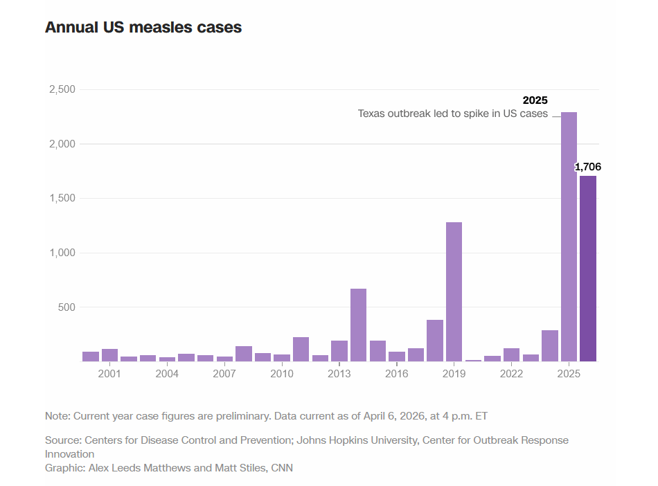
The graph below is an example of data visualisation from a CNN Health article published in February 2026 (“Tracking measles cases in the United States through maps and charts.”, https://www.cnn.com/health/tracking-measles-cases-us-maps-vis). It is a live article updated weekly concentrating on measles cases in the US. This highly contagious disease, which was eradicated in the past due to high vaccination rates, seems to be making a major comeback in the US. CNN aims to inform and keep the public updated on the latest numbers. The article offers live updated graphs showing the latest CDC data. The bar chart below is the centrepiece, showing the annual US measles cases.
The chart is making the reader aware of the dramatic increase of measles cases with the visual contrast it creates. A reader does understand the core message immediately: something has gone very badly wrong in the last two years. The long timeline of the graph is also very well chosen. By starting the chart in 2000 – the year measles was declared eliminated in the US – the chart places the current outbreak in its proper historical context.
One potentially misleading thing is, that the chart shows raw numbers rather than rates. The US population is significantly larger in 2026 than it was in 2000. A chart showing cases per million people, for example, would give a more accurate picture. Although the current outbreak is genuinely severe, the comparison with previous outbreaks is more difficult with only the raw case numbers.
Data visualisation and infographics are powerful information tools, but with great power comes great responsibility. We should be careful and double-check every detail to make sure we don’t mislead readers or distort the truth.

Leave a comment